

Choosing The Perfect Colours For Business Signage
Most new and aspiring business owners understand that colour choices and visual impact are of massive importance when designing logos and business signs–but that doesn’t mean they necessarily know how to use them! If you’re designing the signage for your business, how can you know which colours to choose and which to avoid? Read on to learn a little more about how to make this decision.
Maintain your business’s brand identity
A strong visual brand identity is a vital part of building a solid business, and that goes further than just your logo. It’s likely that you have a logo already, and that you considered visual brand identity while it was being designed–so make sure you bring everything you learned from doing that into your signage, and use the same visual themes on a larger scale. Picking the colours you used in your logo will help your business’s identity to develop, and allow you to incorporate that logo into your sign neatly and seamlessly.
Consider a colour’s emotional resonance
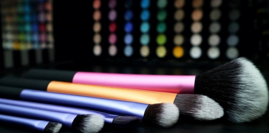
There’s a lot of evidence to suggest that colour provokes strong responses in people–and when you’re designing business signage you can use those responses to your advantage. If you’re running a spa, for example, you want to induce feelings of soothing and relaxation in your customer base; soft blues and minty greens are a great choice for that. A print shop would do well to use a full spectrum of vivid colours somewhere in their signs and advertisements, to put people in mind of quality printing and perfect hues.
Use a colour wheel to make good choices
Colour theory is a surprisingly large and complex field, and designers the world over use it every day to achieve the results their customers require. You don’t need to be an expert to make use of its basic principles, however: all you need is a simple colour wheel. Start with the main colour on your logo: would you like to complement it or contrast it? Complementary colours (the ones next to each other on the wheel) work harmoniously together to create a feeling of continuity, while contrasting colours (the one directly opposite) make each other stand out and create something truly eye-catching. A hairdresser’s salon and a nightclub might both use blue-green in their colour branding, but while the salon is more likely to complement that colour with true blue and true green to create a soothing look, the club would do better to contrast it with red-orange and really grab people’s attention.
Whatever you choose, the important thing to bear in mind is that you’ve got to like the design you end up with and the colours it involves. This is a brand identity you’ll likely be living with for a long time, so make sure you pick something you’re going to enjoy being around!